Admin Dashboard
The Admin Dashboard provides a comprehensive overview of API usage, user statistics, and other key metrics for your application. This dashboard is integrated with Supabase for data management. You can change the data whatever you want to show in your dashboard as per your requirement.
You can test the admin dashboard page here (opens in a new tab). Please make sure you are logged in when you try to access it in the browser, as it is a protected page.
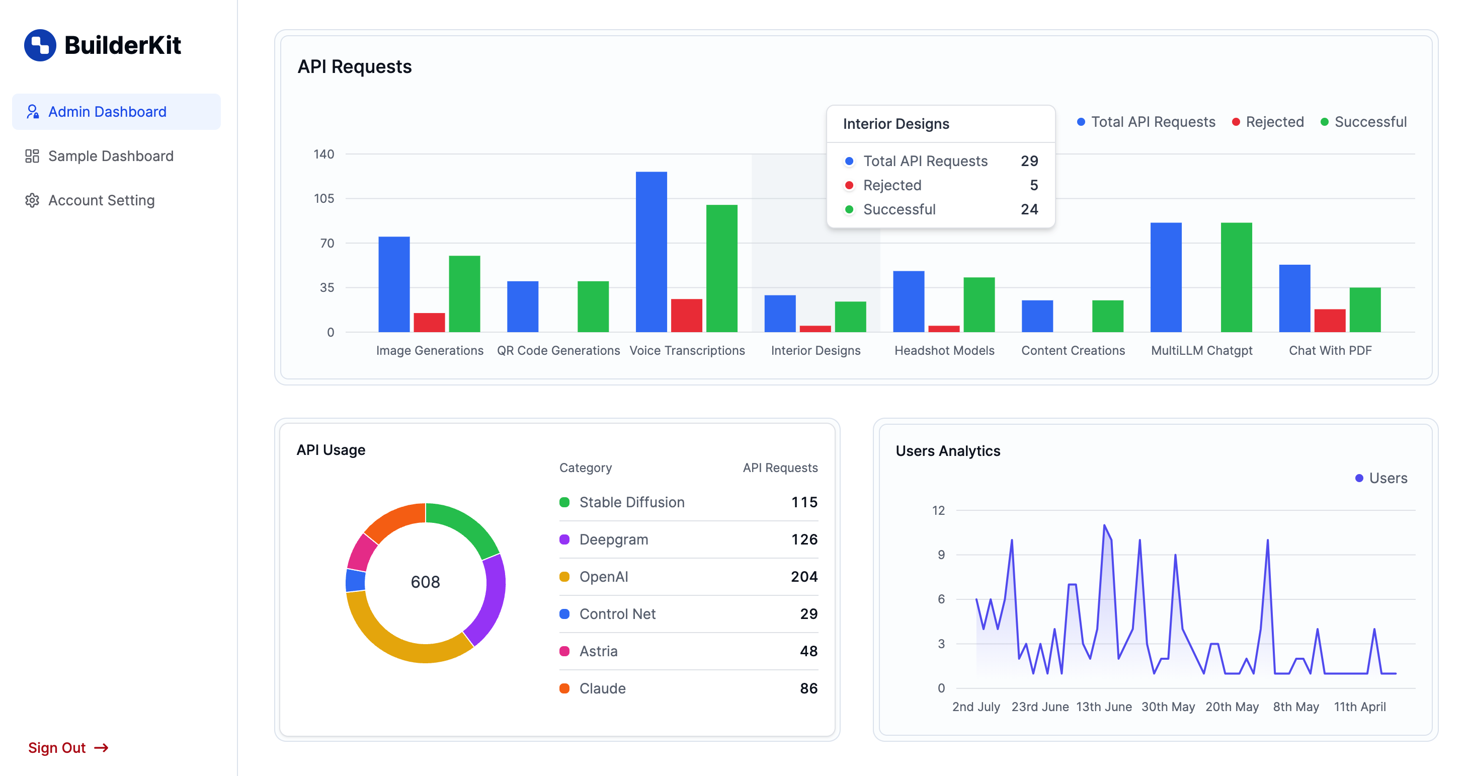
The Dashboard also contains sample dashboard (opens in a new tab) and account setting (opens in a new tab) page along with the admin dashboard page as seen in the above image.
Components
The Admin Dashboard consists of the following main components:
- Admin Dashboard Page: The main page component (
src/app/(dashboard)/admin-dashboard/page.tsx) - ApiRequestChart: Displays a bar chart of API requests (
src/components/dashboard/admin-dashboard/ApiRequestChart.tsx) - ApiUsageChart: Shows a donut chart of API usage by category (
src/components/dashboard/admin-dashboard/ApiUsageChart.tsx) - UserStatsChart: Presents an area chart of user growth over time (
src/components/dashboard/admin-dashboard/UserStatsChart.tsx)
ApiRequestChart Component
The ApiRequestChart component displays a bar chart showing the total API requests, rejected requests, and successful requests for different services.
Props
interface ChartData {
chartData: {
    name: string;
    'Total API Requests': number;
    Rejected: number;
    Successful: number;
}[];
}
How to use
import ApiRequestChart from '@/components/dashboard/admin-dashboard/ApiRequestChart';

const MyComponent = () => {
const chartData = [
    // ... your chart data here
];

return <ApiRequestChart chartData={chartData} />;
};
ApiUsageChart Component
The ApiUsageChart component shows a donut chart representing API usage categorized by different services.
Props
interface ApiUsageChartType {
chartData: {
    name: string;
    'Total API Requests': number;
    Rejected: number;
    Successful: number;
    entries?: { chat_history: any[]; model: string | null }[];
}[];
}
How to use
import ApiUsageChart from '@/components/dashboard/admin-dashboard/ApiUsageChart';

const MyComponent = () => {
const chartData = [
    // ... your chart data here
];

return <ApiUsageChart chartData={chartData} />;
};
UserStatsChart Component
The UserStatsChart component displays an area chart showing user growth over time.
Props
interface UserStatsChartProps {
users: TypeUser[];
}
How to use
import UserStatsChart from '@/components/dashboard/admin-dashboard/UserStatsChart';

const MyComponent = () => {
const users = [
    // ... your user data here
];

return <UserStatsChart users={users} />;
};
Data Fetching
The AdminDashboard component fetches data from various Supabase tables. Here's an overview of the data fetching process:
-
Define the tables to fetch data from:
const tables = [ { name: 'Image Generations', table: 'image_generations', field: 'image_urls' }, { name: 'QR Code Generations', table: 'qr_code_generations', field: 'image_url' }, // ... other tables ]; -
Fetch data from each table using Supabase:
const chartData = await Promise.all( tables.map(async ({ name, table, field }) => { const { data, error } = await supabaseAdmin.from(table as SupabaseTable).select(field); // ... process the data return { name, 'Total API Requests': totalRequests, Rejected: totalRequests - successful, Successful: successful, entries: data, }; }) ); -
Fetch user data:
const { data: users } = await supabaseAdmin
.from('users')
.select('*')
.order('created_at', { ascending: false });
Customization
To customize the Admin Dashboard:
- Modify the
tablesarray inAdminDashboardto add or remove data sources. - Adjust the chart components (
ApiRequestChart,ApiUsageChart,UserStatsChart) to change the visualization or add new features. - Update the styling by modifying the CSS classes or Tailwind utility classes used in the components.