Modal Component
The Modal component is a reusable and customizable dialog box that can be used to display content, prompts, or confirmations in your application. It provides a clean and intuitive way to present information to users and gather their input or acknowledgment.
You can find the Modal component in src/components/Modal.tsx.
Props
The Modal component accepts the following props:
title(required): The title of the modal dialog.children(required): The content to be displayed inside the modal dialog. It can be any valid React node.className(optional): Additional CSS classes to be applied to the modal dialog content.labelModalButton(optional): The label for the button that triggers the modal. Defaults to "Open Modal".styleModalButton(optional): Additional props to style the modal trigger button.labelActionButton(optional): The label for the action button inside the modal. Defaults to "Continue".includeCancelButton(optional): Determines whether to include a cancel button in the modal. Defaults totrue.actionButtonVariant(optional): The variant of the action button. Defaults to "default".handleAction(optional): A function to be called when the action button is clicked.
Usage
To use the Modal component in your application, follow these steps:
-
Import the Modal component into your desired file:
import Modal from "@/components/Modal"; -
Use the Modal component in your TSX, providing the necessary props:
<Modal
  title="Confirm Action"
  labelModalButton="Open Modal"
  labelActionButton="Confirm"
  handleAction={handleConfirmAction}
>
  <p>Are you sure you want to perform this action?</p>
</Modal>
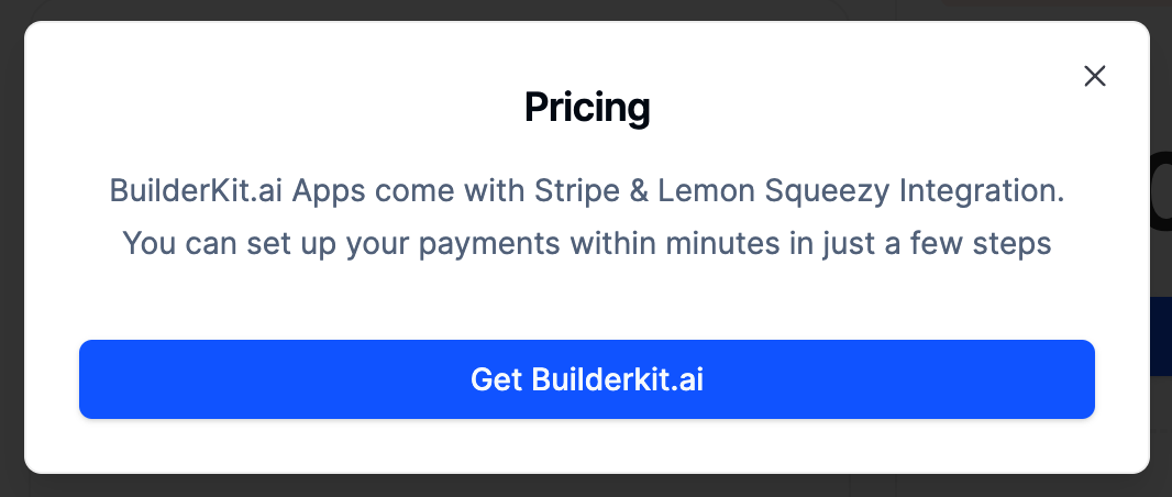
Appearance
The Modal component has a clean and modern appearance, with a header, content area, and footer containing action buttons. The modal dialog is centered on the screen and can be customized using CSS classes or props.
Here's an example of how the Modal component looks:
The Modal component is fully responsive and adapts to different screen sizes. On smaller screens, the action buttons stack vertically to ensure optimal usability.
Customization
The Modal component provides various props to customize its appearance and behavior:
className: Apply additional CSS classes to the modal dialog content to customize its styling.styleModalButton: Pass additional props to style the modal trigger button.actionButtonVariant: Choose from different button variants for the action button inside the modal.includeCancelButton: Determine whether to include a cancel button in the modal footer.