InputWrapper Component
The InputWrapper component is a flexible and reusable wrapper for various form elements, providing consistent styling and behavior. It supports labeling, optional comments, descriptions, error handling, and extra options.
You can find the InputWrapper component in src/components/InputWrapper.tsx.
Structure
The InputWrapper component consists of the following elements:
- Label: Displays the label text for the input field.
- Comment: Shows a lighter, smaller text next to the label to provide additional information about the field.
- Info Popover: Allows for a context-sensitive help or additional information to be displayed in a popover.
- Children: Placeholder for form elements like
<input>,<textarea>, etc. - Description: Displays additional details or guidelines below the input field.
- Error: Shows an error message and an icon if there is an error related to the input field.
- Extra Option: Allows for an additional interactive element (like an icon) to be placed next to the label.
Props
The InputWrapper component accepts the following props:
id(optional): Associates the label with an input element for accessibility.label(optional): The text label displayed for the input field.comment(optional): A lighter, smaller text used to add additional information about the field.description(optional): Displays additional details or guidelines below the input field.infoPopover(optional): Can be used to provide context-sensitive help or additional information in a popover.error(optional): Displays an error message and an icon if there is an error related to the input field.children(optional): The input elements or components that the wrapper will encapsulate.extraOption(optional): Allows for an additional interactive element (like a button) to be placed next to the label.className(optional): Allows for custom styling by adding additional CSS classes.
Usage
To use the InputWrapper component, follow these steps:
- Import the
InputWrappercomponent in your desired file:
import InputWrapper from "@/components/InputWrapper";
import { HiOutlineMail } from "react-icons/hi";- Wrap your form elements (
<input>,<textarea>, etc.) inside theInputWrappercomponent:
<InputWrapper
  id="email"
  label="Email"
  comment="(optional)"
  description="Enter your email address"
  error={emailError}
  extraOption={<HiOutlineMail />}
>
  <input type="email" id="email" />
</InputWrapper>
In this example, the InputWrapper component wraps an email input field, providing a label, comment, description, error handling, and an extra "Icon" option.
- Customize the
InputWrapperby providing the appropriate props based on your requirements.
The InputWrapper component will automatically handle the labeling, error messages, descriptions, and extra options for your form elements.
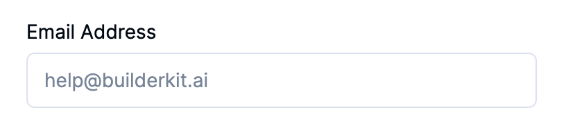
Appearance
Here's an example of how the Input Wrapper component looks:
That's it! You can now easily use the InputWrapper component to ensure consistent styling and behavior across your form elements.