Shadcn
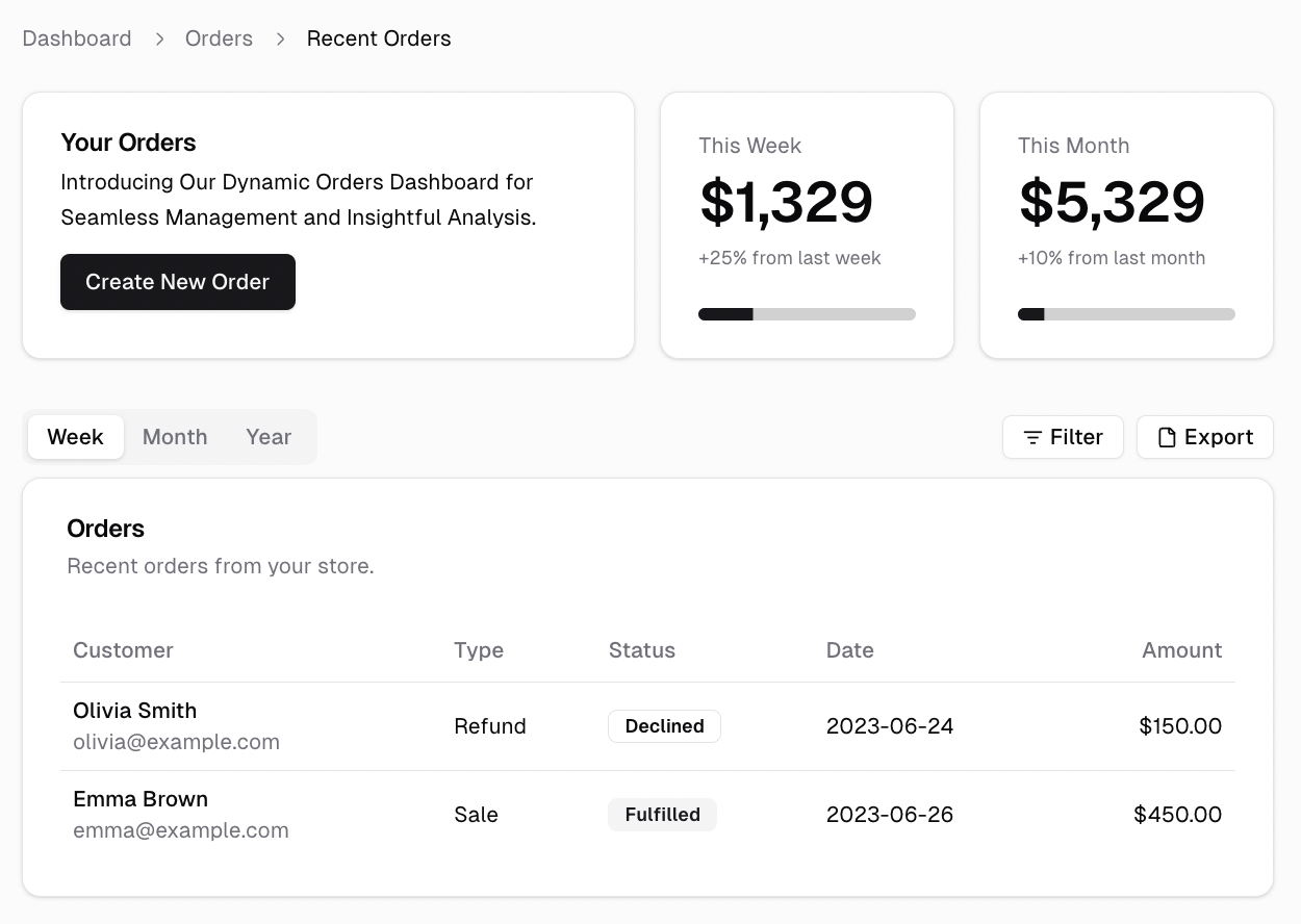
Shadcn is a collection of pre-built, highly customizable UI components designed to work seamlessly with your Next.js projects. These components follow best practices and are easy to integrate, making your development process more efficient and streamlined.

For more examples and detailed usage, visit the Shadcn component library (opens in a new tab).
Shadcn components are located in the src/components/ui folder of your project. This folder contains all the reusable UI components that you can import and use throughout your application.
- button.tsx
- card.tsx
- use-toast.tsx
- ...
Usage
To use Shadcn components, simply import them into your React components as needed. Below is a quick guide on how to integrate a few common Shadcn components into your project.
Button Component
The Button component is a versatile UI element used for various interactive actions in your application.
Importing the Button Component:
import Button from "@/components/ui/Button";

export default function HomePage() {
  return (
    <div>
      <Button onClick={() => alert("Button clicked!")}>Click Me</Button>
    </div>
  );
}
Card Component
The Card component is used to display content in a structured and visually appealing way.
Importing the Card Component:
import Card from "@/components/ui/Card";

export default function HomePage() {
  return (
    <div>
      <Card title="Card Title" description="This is a description of the card.">
        <p>Additional content can go here.</p>
      </Card>
    </div>
  );
}
Toast Component
The Toast component is used for displaying alert messages.
Importing the Toast Component:
import { toast } from "@/components/ui/use-toast";

export default function HomePage() {
  toast({
    title: "Toast Title",
    description: "Toast Description",
    variant: "destructive",
  });

  return <></>;
}
Add more components
You can add more shadcn components to your project by running the following command:
npx shadcn-ui@latest add [COMPONENT_NAME]Find the list of all component and the "COMPONENT_NAME" from the official documentation (opens in a new tab).